
Featured New Organic
Organic Heirloom Tomatoes
Sweet and juicy heirloom tomatoes, perfect for salads or sandwiches
Mobile-first e-commerce components designed for local farmers markets. Each component is optimized for touch interactions and accessibility.
The core component for displaying products. Features responsive design, touch-optimized interactions, and real-time stock status.
Sweet and juicy heirloom tomatoes, perfect for salads or sandwiches

Aromatic fresh basil, perfect for pesto or caprese
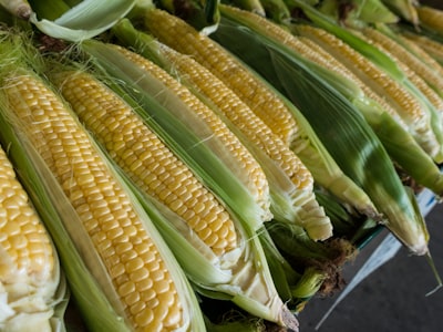
Freshly picked sweet corn, great for grilling
Colorful and nutritious chard, great for sautéing

Raw, unfiltered honey from local wildflowers

Sweet cherry tomatoes, perfect for snacking
The enhanced ProductCard supports an edit mode for growers and market managers, allowing in-place editing of product information directly from the market page.
 Happy Acres Farm Happy Acres Farm
This is a planning phase mockup of the proposed Product Varieties feature. The design allows products to have multiple variations (sizes, colors, or units) managed as a single product with selectable options.
Customers see one product with options instead of cluttered listings
Growers manage 1 product with varieties instead of 5 separate products
One description, one image, one category for all size/color variations
Each variety can have its own price, unit, and inventory
Try selecting different varieties and adjusting quantities. Each variety has its own price, unit, and stock level.
For products with a few varieties, customers use a simple dropdown to select their option.
Beautiful heirloom tomatoes available in multiple sizes

Free-range eggs from happy chickens, available by the half dozen or dozen
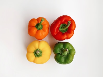
Crisp bell peppers in assorted colors
Unfiltered local honey from wildflowers
For products with many varieties, the system automatically switches to a grouped button layout for better usability. This example shows reusable shopping bags with 9 varieties (3 sizes × 3 colors). Try selecting different combinations - sold out options are automatically disabled.

Eco-friendly reusable shopping bags in various sizes and colors
Growers have two ways to manage varieties: quick edits on the product card, or full editing in the product modal.
For products with varieties, the product card in edit mode shows a summary with a link to manage varieties in the modal.
Clicking "Manage Varieties" opens the modal where growers can add, remove, reorder, and edit all variety details.
Growers can set up variety groups (like "Size" and "Color") to automatically generate the button grid layout. The system detects the pattern from variety names.
💡 Group varieties by attributes like size, color, or flavor. The system will automatically create a button grid for customers when 6+ varieties are detected.
48px minimum touch targets and optimized for small screens
GPU-accelerated animations and lazy-loaded images
WCAG AAA compliant with full keyboard and screen reader support
CSS custom properties for easy market customization
Live stock updates and reactive state management
Adapts seamlessly from mobile to desktop layouts
// Import the component
import ProductCard from '$lib/components/market/ProductCard.svelte';

// Example product data
const product = {
  id: 1,
  name: 'Organic Tomatoes',
  price: 4.99,
  unit: 'lb',
  quantity: 25,
  growerId: 1,
  categoryId: 15,
  // ... other properties
};

// Example grower data
const grower = {
  id: 1,
  name: 'Happy Acres Farm',
  location: 'Watkinsville, GA',
  growingMethod: 'organic',
  // ... other properties
};

// In your component template:
<ProductCard
  {product}
  {grower}
  featured={true}
  onAddToCart={(product) => addToCart(product)}
  onQuickView={(product) => showQuickView(product)}
/>| Prop | Type | Default | Description |
|---|---|---|---|
product * | Product | — | Product data object containing id, name, price, unit, quantity, etc. |
grower * | GrowerInfo | — | Grower information including name, location, growingMethod, etc. |
featured | boolean | false | Highlights the product with a special badge and styling |
distance | number | — | Distance to the grower in miles (optional) |
loading | boolean | false | Shows skeleton loading state |
onAddToCart | (product: Product) => void | — | Callback fired when add to cart button is clicked |
onQuickView | (product: Product) => void | — | Callback fired when quick view button is clicked |
Sweet and juicy heirloom tomatoes, perfect for salads or sandwiches
Raw, unfiltered honey from local wildflowers
Colorful and nutritious chard, great for sautéing
Sweet and juicy heirloom tomatoes, perfect for salads or sandwiches
Hierarchical category selector with multi-level navigation, search, and bulk selection. Supports keyboard navigation and screen readers for accessibility.
// Import the component
import CategoryTreeSelector from '$lib/components/market/CategoryTreeSelector.svelte';

// Define your category data
let selectedCategories = [];
const categories = [
  { id: 1, parentId: null, name: 'Produce', productCount: 45 },
  { id: 11, parentId: 1, name: 'Vegetables', productCount: 22 },
  { id: 111, parentId: 11, name: 'Root Vegetables', productCount: 7 },
  // ... more categories
];

// Handle category selection changes
function handleCategoryChange(ids) {
  // Update your state or filter products
}

// In your component template:
<CategoryTreeSelector
  {categories}
  bind:selectedCategories
  mode="multiple"
  searchable={true}
  expandedByDefault={false}
  onCategoryChange={handleCategoryChange}
/>| Prop | Type | Default | Description |
|---|---|---|---|
categories * | Category[] | — | Array of category objects with hierarchical structure (id, name, parentId, etc.) |
selectedCategories | number[] | [] | Array of selected category IDs (bindable with bind:selectedCategories) |
mode | 'single' | 'multiple' | 'navigation' | 'multiple' | Selection mode: single selection, multiple selection, or navigation only |
loading | boolean | false | Shows loading skeleton state |
onCategoryChange | (ids: number[]) => void | — | Callback fired when selection changes |
onCategoryNavigate | (id: number) => void | — | Callback fired in navigation mode when a category is clicked |
expandedByDefault | boolean | false | Start with all nodes expanded |
showProductCounts | boolean | true | Display product counts for each category |
searchable | boolean | true | Enable search functionality with highlighting |
compactMode | boolean | false | Reduced spacing for dense layouts |
Fired when category selection changes. Receives array of selected category IDs.
onCategoryChange={(ids) => {
  // Update your state or filter products
}}Fired in navigation mode when a category is clicked. Receives the category ID.
onCategoryNavigate={(id) => {
  // Navigate to category page
  goto(`/market/category/${id}`);
}}